


Posted In
Fashion Week
|
0
comments
|
![]()


Posted In
Fashion Week
|
0
comments
|
![]()


Posted In
Fashion Week
|
0
comments
|
![]()


Posted In
Fashion Week
|
|
![]()


Posted In
Fashion Week
|
|
![]()
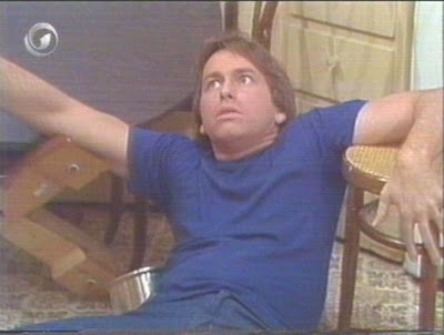 A number of factors contribute to the whole that makes up Jack Tripper’s fashion sense. In many ways, Tripper’s clothes are emblematic of the era and setting of the series he was mainstay on, Three’s Company. Certainly, his style epitomizes 1970s, American sportswear, but what makes Tripper stand out as a fashion icon is the casual nuance, boyish charm, and California cool that he imbued into each outfit. The result, for over eight seasons of Three’s Company, Jack was the informal, but ubiquitous, clothes horse of the series.
 Jack’s breezy casualness was chic, smart, and timeless. Tripper was always dressed in classic separates, natural toned clothes that were modish in their simplicity. Often donning solid color polo shirts or sweaters over hip hugging pants (not as exaggerated as bellbottoms, but not as slim as boot cut), his timeless looks and unpretentious charm remarkably stood out against a cast that included the ornate caftans of Ms. Roeper and the Technicolor leisure suits worn by Mr. Furley.
  Jack’s clothing style was much like profession. As the series began, Jack was a cooking student who eventually graduated into becoming a chef. While his clothes don’t directly reflect this gradual assention up the restaurant food chain, his style does reflect a unmuddled ease and California nouveau style that is part Meditation, part South Western, with natural/fresh overtones.
 Regardless of what precisely Jack wore, it usually retained the same rudimentary ‘disco’ cut throughout the show. The torso is cut slim, while the pants begin to flair at the knee. While this is influence of the era of the show and elementary demonstrates Tripper’s keenness to stay atop concurrent East Coast and West Coast trends of the late 70s.
 Perhaps having two attractive female roommates to bounce clothing ideas off of is what made Jack such a snazzy dresser. It didn’t hurt either that the two women represented extremes in clothing sensibilities, classic/conservative vs. trendy/chic. Both his roommates, were nice dressers as well, but it was Jack and it you, beachy, authentically laid back look that transcends through the revolving roommates, landlords, and Janet’s perm.
Posted In
Style Icons
|
|
![]()
 Sometimes you find a pair of underwear that makes you smile knowing you’re wearing them. Timoteo’s Super Low Briefs have found that spot in my heart and in my underwear drawer. Timoteo Ocampo is an American designer whose LA based company, Timoteo, is quickly making waves in the men’s underwear and swimwear. Its easy to see why at first glance. The designs from Timoteo’s studios are rugged, but sexy. The exposed waistband is a nice 1 5/8 inches wide, in strong elastic, and stitched with "Timoteo" in subscripted Gothic font. The logo is perfectly centered over the crotch, before repeating around the waist. The subscript lettering and Olde World font lends visual interest, while giving waft of masculinity to the otherwise skimpy garment.
 The briefs I ordered were size small, in a deeply saturated red. The fit is true to size, and after owning, wearing, and washing them over the past few months, the color has barely faded at all. Even better, the waistband shows no signs of warping or fraying. They are made of 96% Cotton and 4% Spandex, they have great fit, stretch well, and retain their shape. The material (what there is of it) is extremely soft. The briefs are made of seven panels: six in the front, and a full back. The crotch is made of two center seamed panels layered atop one another. There is a small Timoteo logo tab, approx (½ in square) sewn into the left-side seam, I found it unnecessary, but it's small enough to easily live with or remove.
.jpg) 5 / 5ths Rooster!
5 / 5ths Rooster!
Posted In
Skivvy Scrutiny
|
0
comments
|
![]()


THE gallant guy | Powered by Blogger